The Ultimate Paint Guide for Every Room In The House
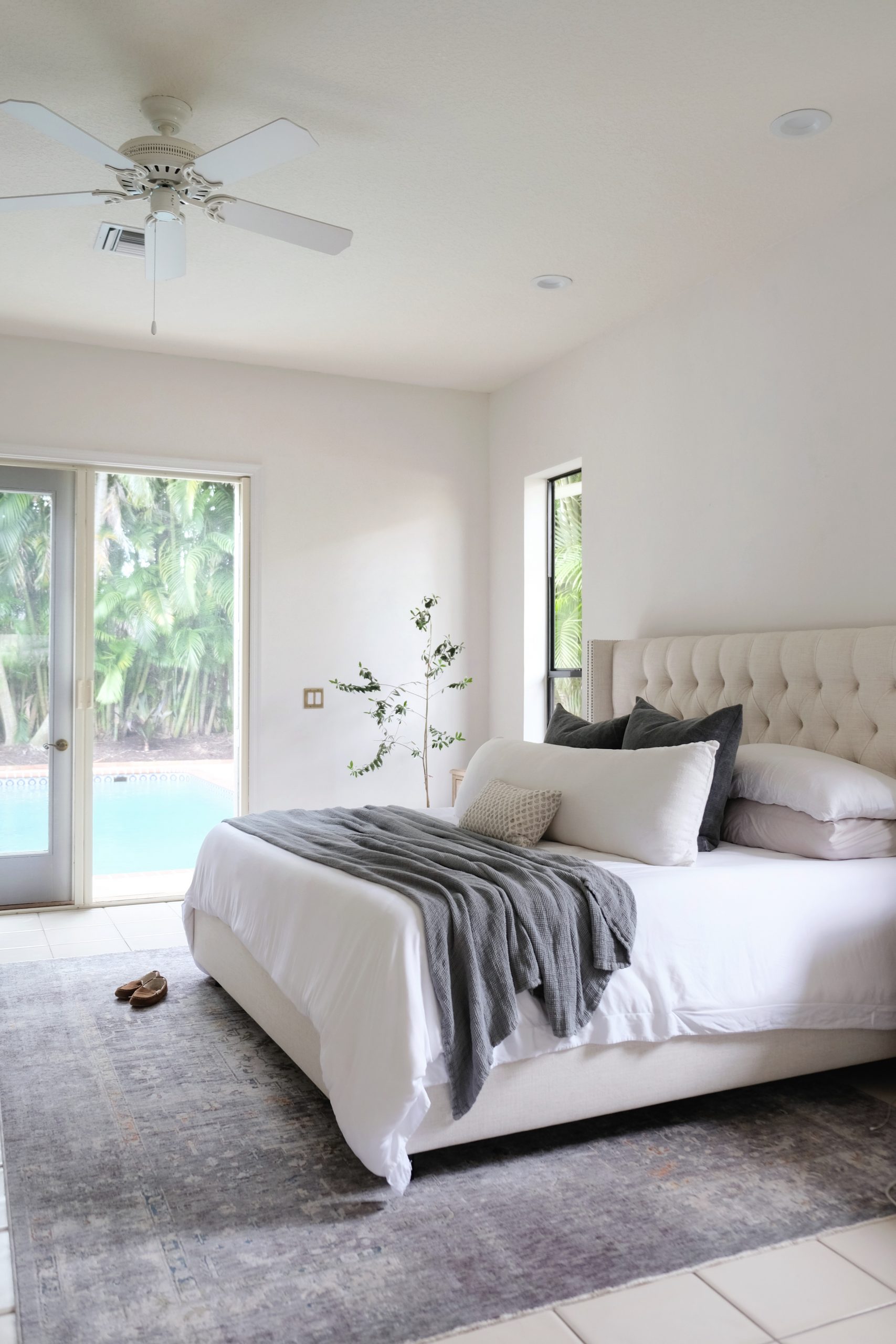
We have been in our home four months now and we are officially done painting the interior! (Well, except for the bathrooms and kitchen which will get gut renovated in the coming years.) As prior serial renters, paint has always been my strongest design tool. I’ve learned a lot about picking the right colors and avoiding the wrong ones over the years. I’ve put together a step-by-step guide to choosing the perfect paint color for every space in your house.
1. Choose a Vibe, Not a Color
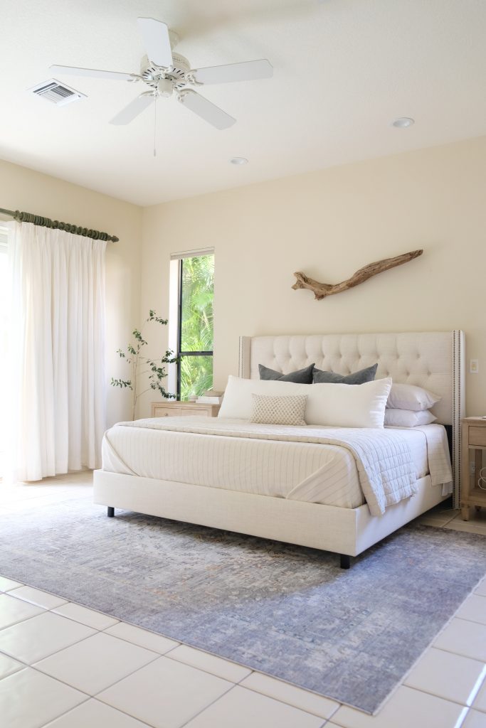
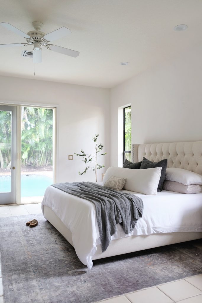
Choosing paint is not really about choosing a color. We’re so often tempted to start the whole process by deciding on a color family, only to find that the end-result isn’t quite what we had imagined or that we’ve created a whole host of new design dilemmas. Instead, I’ve learned to start the process by choosing a feeling. How do I want the space to feel when I’m in it? Energetic? Zen? Sharp and modern? Or like it’s been there forever and has stories to tell? I was really adamant that our bedroom felt really fresh and grounded. I didn’t want it to just be calm, I wanted it to actually be conducive to restoration; to feel the way a spa feels when you go to get pampered. We could immediately jump to some assumptions on colors that might achieve that goal, but I won’t just yet.
2. Consider Your Existing Style & Architecture
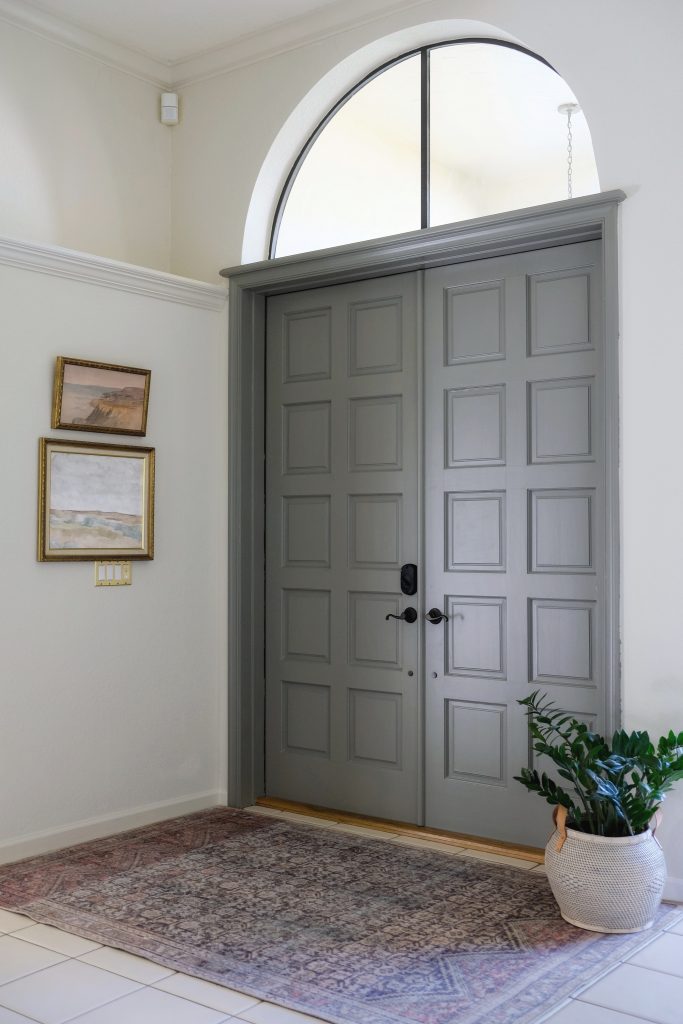
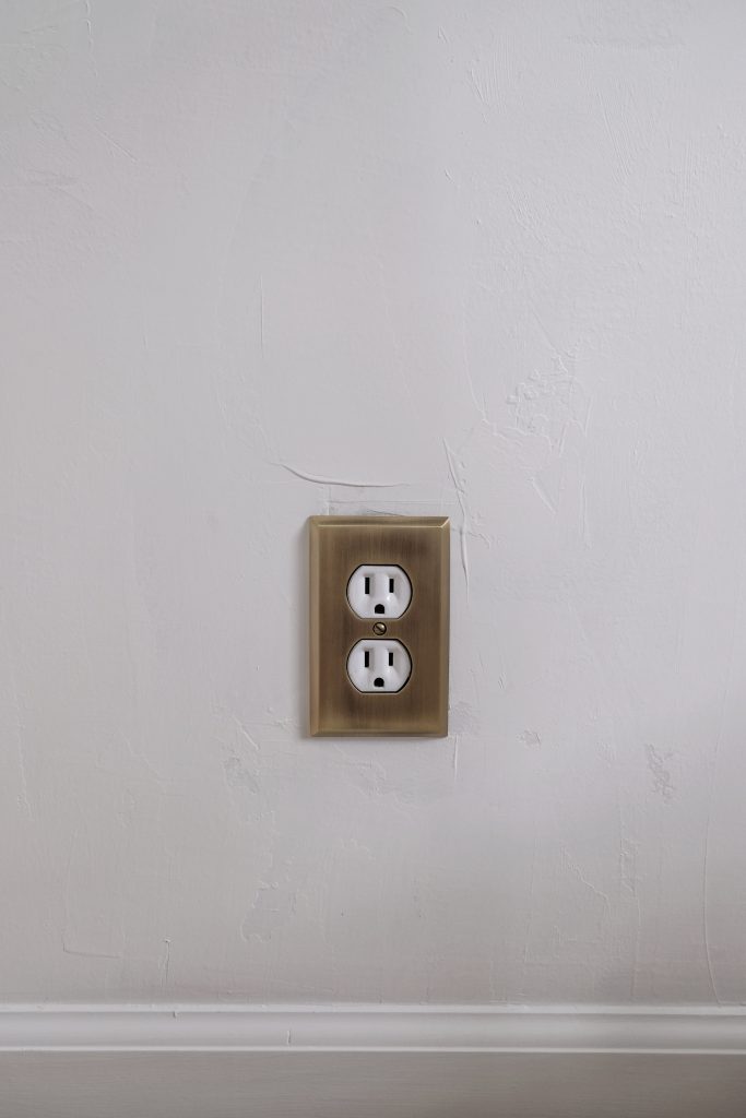
Design is a form of creative expression, so there really are no rules. However, keeping your interior style in line with your architecture definitely helps narrow down the otherwise infinite options. Our house, for example, is a fairly generic 90’s stucco house with just a few key elements that lend itself to Spanish Modern architecture. I decided early on that any improvements we make to the home will be in that design direction. And that includes paint! I spent a lot of time looking at photos of other Spanish Modern homes to get a feel for the common details that defined that style. Over and over again, I saw textured white walls in a flat sheen with very simply trim work. That gave me a well-defined direction to go in. But there’s still more to think about…
3. Assess Your Natural Light and Understanding LRV
The next most important step is assessing the natural light in your space. This is going to determine the LRV level of your paint choice. LRV stands for Light Reflectance Value and refers to the amount of light that is either reflected by or absorbed by a color. You’ll often find the LRV expressed as a number between 0 and 100 on your paint chip. The higher the number, the more light the color will reflect back in to your space and the brighter it will look. Generally speaking, a paint color with an LRV of 60 or higher will help brighten up a space (which may or may not be your goal.)
LRV for Common Spaces
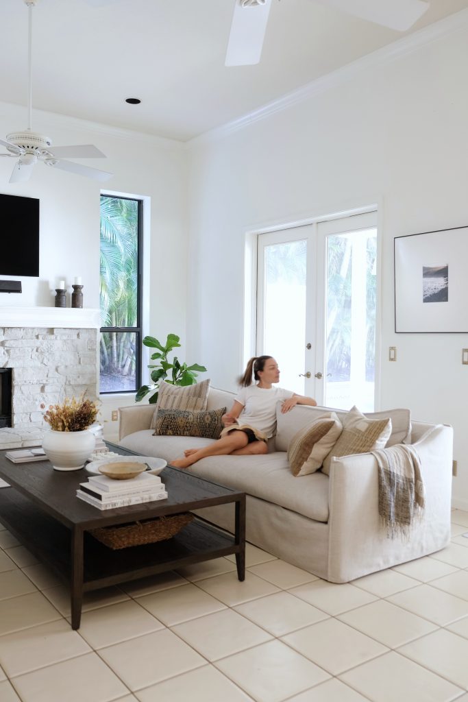
I typically recommend an LRV of 60 or higher for rooms that are common spaces or that are part of an open floor plan. These tend to be your activity rooms – like the kitchen and living room – and for functional reasons, it often makes sense that these rooms be brighter overall. (Again, there are no rules, so a if you will enjoy something moodier, go for it!) Bedrooms, formal dining rooms and dens are great places to experiment with lower LRV colors since brightness isn’t necessarily needed in those spaces.
LRV for Windowless Rooms
Contrary to popular assumption, choosing a high LRV in a windowless room might not be the best choice. In windowless rooms, the only light that your paint color will reflect is artificial light which is usually much yellower than natural light. This means that your otherwise bright color will likely come off yellowed and drab. Try going for some mid-range LRVs, instead. By choosing a lower LRV, you’re reducing the amount of light reflection and allowing the color to read a bit truer.
4. Choosing An Undertone
We can think of undertones in two categories: as a color (mainly blue, green, red and yellow) and as a tone (cool or warm.) Color undertones are the secondary pigments in a formula. If you have a grey paint for example, grey is the dominant color, but some other colors – let’s say green for example – may have been used in small quantities to achieve that specific hue of grey. Depending on the surrounding light and environment, that green undertone might become a bit more apparent. Similarly, whether it is a cool or warm tone may also become more or less apparent. Each is useful in different amounts and situations. Slightly warm tones can invoke a sense of coziness while heavily warm tones can feel energetic. Cooler tones can feel very calm and soothing but go too cool and it can feel crisp and stark.
Windowless Rooms
Generally, more saturated colors with warm-leaning undertones will perform better in a windowless room. Lighter pigments or ones that lean cool can fall flat without any natural light to liven them up.
North Facing Rooms
North-facing rooms receive soft, cool, filtered light all day long. To balance this out, you’ll want to try colors with slightly warmer undertones.
South Facing Rooms
The light in south facing rooms is brighter and warmer. Cool-toned hues can perform really well in these spaces because the natural warm light will keep them from feeling too stark.
East & West Facing Rooms
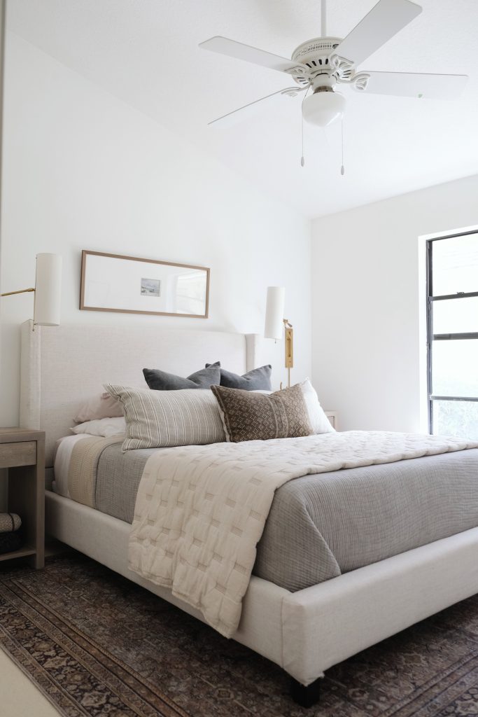
West facing rooms get soft, cool light in the morning and bright, warm light in the evenings. Since the warm light is stronger, you might opt for cooler undertones or stick to somethin neutral. East facing rooms are the opposite so opt for slightly warmer undertones or stick to neutrals here, as well.
5. Sheens & Finishes
Sheen refers to the amount of shine that a paint has when dry. Higher sheens (glossier paints) are more durable, water-resistant and easier to clean. They also reflect the most light back into the space. Lower sheens can get scuffed up a bit easier but tend to feel calmer in a space. It’s generally a good idea to use
The four most common sheen levels from lowest to highest sheen are: Flat, Eggshell, Satin, Semi-Gloss.
Flat is a great choice for naturally bright, less-used spaces like a bedroom or office. For rooms that could use little brightening, I love using Eggshell on the walls to reflect just a touch more light back into the space. Satin is great for kitchen and bathroom walls and Semi-Gloss is always a good idea for trim and cabinetry – the things that will likely endure the most traffic.
Remember that light plays a big factor in how your color reads, so make sure you test a color in the specific sheen you’re considering.
6. Paint Types
This could be an entire post on it’s own, so let’s stick to the most common types. Enamel paint is typically used on high-traffic surfaces like interior doors, it sticks to most surfaces and essentially “seals” whatever it’s applied to. Latex paint – what you probably pick up from your local hardware store – is more breathable than enamel but not quite as durable.
Water-based paint is very easy to apply, easy to clean up and resists yellowing or fading better than other types. It’s also much healthier for you and the environment because it is made without harsh chemicals or VOCs. For these reasons, I chose to use water-based paint exclusively throughout our home.
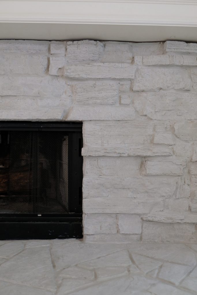
It’s also worth mentioning that specialty paints like Roman Clay (plaster) and Lime wash paints are all-natural water-based paints. They both add tons of character to a surface and even improve the health of the space. Lime wash, for example, can help reduce odors by absorbing toxins and even keep a room cooler!
7. Think About Your Furniture and Adjoining Spaces
If you choose a neutral enough color, you can likely get away with painting most spaces in the same hue. This means it will also be easier to decorate around. In this case, I would avoid anything that leans too cool or too warm and that has almost no undertones. However, if you want to be really deliberate about the way each space feels or if you’re wanting a bit of variety in your home, I say switch it up! Just keep two things in mind:
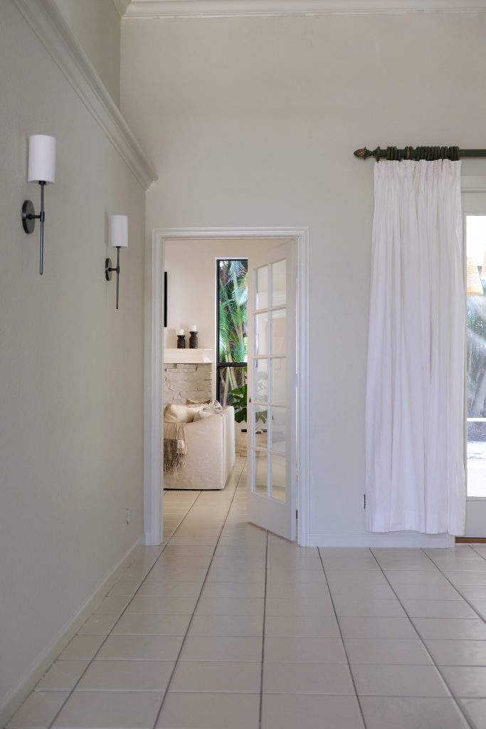
First, consider the furniture and decor that you already have. Does it work with your color choice? Or is it flexible enough that it won’t make future purchases more difficult? Second, consider any adjoining spaces that are visible from the one you are painting. Whatever color you choose should make sense with the colors in those spaces. This is subjective of course, but definitely something you’ll want to confirm as you are making your color decisions.
8. Saving Money on Samples
I have a habit of going through dozens of paint samples before deciding on a color. As you’ve learned throughout this post, there are so many little intricacies that make sampling an absolute necessity. But, it does get expensive. To save money, I recommend carefully reading through your paint chip information so that you can go through Steps 1-6 above and narrow down your choices. If your paint chip doesn’t have all of the info you need, companies often list additional info online. No matter how good a paint chip looks on paper, the numbers can tell a much truer story. You can confidently eliminate anything that falls well outside the parameters we’ve gone through above.
Companies like Clare, Backdrop and Farrow & Ball make it even easier with detailed descriptions and real-life photos of each of their colors.
Finally, you can save trips to the paint store (and maybe a few bucks) by ordering stick-on samples from companies like Samplize.
9. To Prime or Not to Prime
So, after all of that work, you’ve finally chosen a color. If you don’t want all that work to go to waste, then the answer is YES you must prime. Primer promotes better adhesion, a more even application and perhaps most importantly, prevents your previous paint color from acting as a sneaky “undertone”.
My favorite primer is here.
10. Preparation is half 90% of The Battle
I really dislike painting and often skipped preparation steps in effort to make things go faster. But then, I shifted my thinking. Prep is actually way easier and cleaner than painting, so wouldn’t you rather shift your time to the prep part and reduce the amount of time you spend on the messy part? Taping, laying tarp, removing outlet covers and doors – these things are easy to work on when you have a few minutes here and there. Proper preparation will greatly reduce the amount of time you actually spend doing the messy part (painting) and will make all the difference in the quality of the job.
11. Tools
I’ve also learned that investing in the right tools really does make the job easier. Here are my top 10 must haves:
- Frog Tape | Frog tape adhesive is specifically designed to “gel” up the paint when it touches it. As long as you install it properly (be sure to really press the tape down to seal it) you’ll get perfectly crisp lines every time.
- Painters Plastic | Painters plastic has a very strong static cling that allows it to stick to a floor, wall or window on it’s own making it incredibly easy to install. It’s folded very precisely, leaving one edge longer than the rest so that you can tape that edge to your surface and easily unfold the sheet to cover your space. It’s SO easy.
- Step Stool | In addition to a ladder, I like having a step stool on hand to get into tighter spaces like a closet.
- Bulk packs of rollers | Yea, it’s wasteful but it’s also a waste of time to try to clean them after each use (and if you’re not using an all-natural paint, you really don’t want that stuff going down your drain.) Make sure you’re buying the right “nap” for your wall texture – doors and trim require something different than your walls!
- Extension Pole | The less time you have to spend going up and down a ladder (and moving it around the room) the better.
- Paint Sprayer | Even an inexpensive one can give you great results on doors and trim. Yes, you have to spend a lot more time prepping, but you can spray a door in minutes flat and the end result is much nicer.
- Goggles and Masks | If you’re using a sprayer, you definitely need these. And masks are a good idea if you’re using anything other than an all-natural paint type.
- Gloves | It’s all about containing the mess. If I need to leave the room, it’s easy to take the gloves off and not worry about stray paint. I also wear old socks or sandals for this reason!
- Tray liners and paint cups | First, be sure to buy a tray with clips on it. These are meant to hook on to your ladder’s tray extension! Then, buy a bulk pack of plastic liners so you can easily swap out paint without needing to clean your tray.


Looking for more? Subscribe below for my FREE Guide to Decorating
© 2020 gold coast canvas. all rights reserved.

Leave A Comment