
Copy that: Guest Room for Less
The guest room took a few iterations to get right (see all of the crazy versions here) but by the time we moved out of our home, the guest room had become my absolute favorite. I’ve rounded up some budget-friendly lookalikes plus insight into why I chose each piece so that you can recreate the space in your own home!
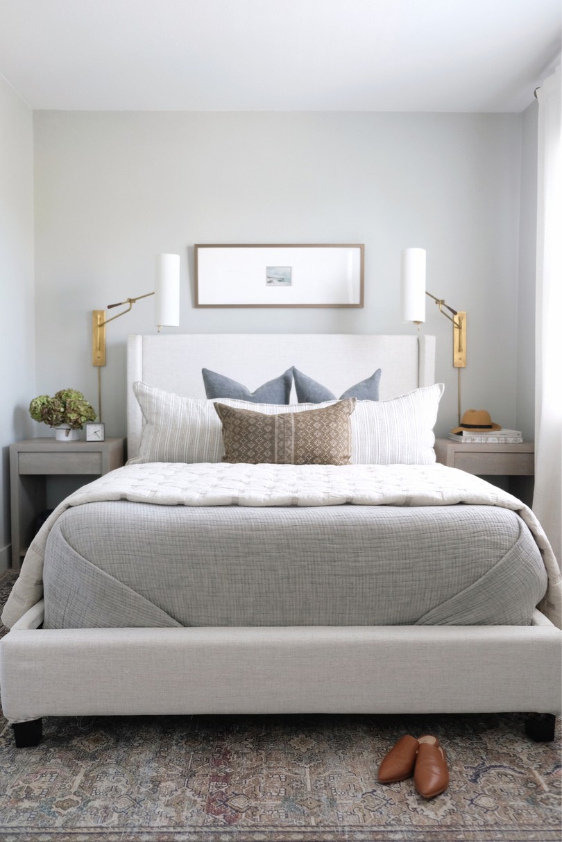
Feature photo by Sarah Natsumi Moore
Disclosure: This post may contain affiliate links which could earn me a small commission if you buy something after clicking one. This doesn’t cost you anything and serves to support this site and all of the hard work that goes into it. Thank you for being part of this online neighborhood!
Bed
When designing a bedroom, I almost always choose a bed first. The bed is the entire reason for the room and thus, in my opinion, deserves priority from both an aesthetic and budgetary standpoint.
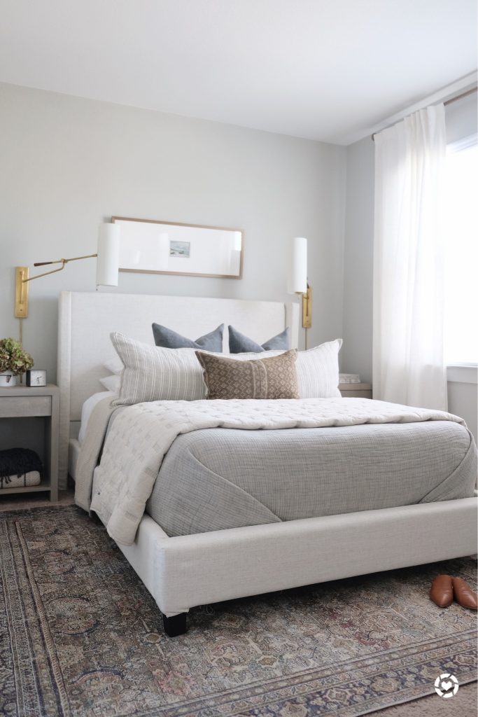
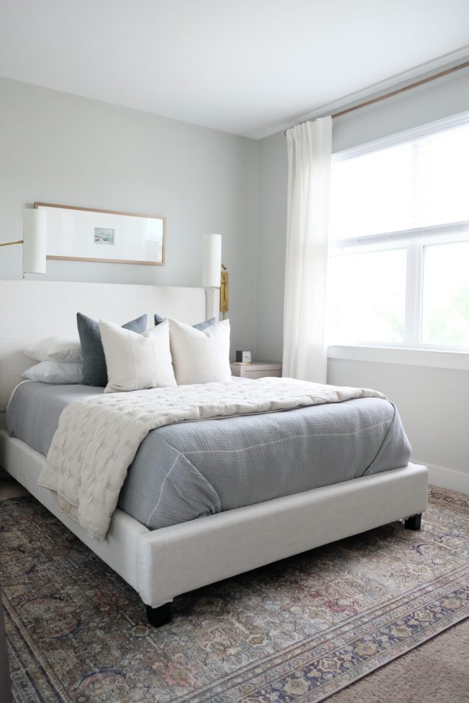
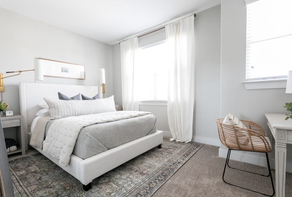
My goal for this room was to create a very warm space with old-world accents that were brought up to date by modern, clean lines. To me, what really sets the stage for this room is the simple lines and unadorned nature of the wing-back bed. For an even more casual and approachable feel, I chose a warm linen upholstery. Note that this bed used to be grey – I reupholstered it in a very easy no-sew method (i.e. lots of staples!) You can read more about that project here.
The lookalike beds and headboards below all come in a popular fabric called “Talc” or “Linen Talc” which is actually the same fabric I used to reupholster mine.
Lookalikes

Nightstands
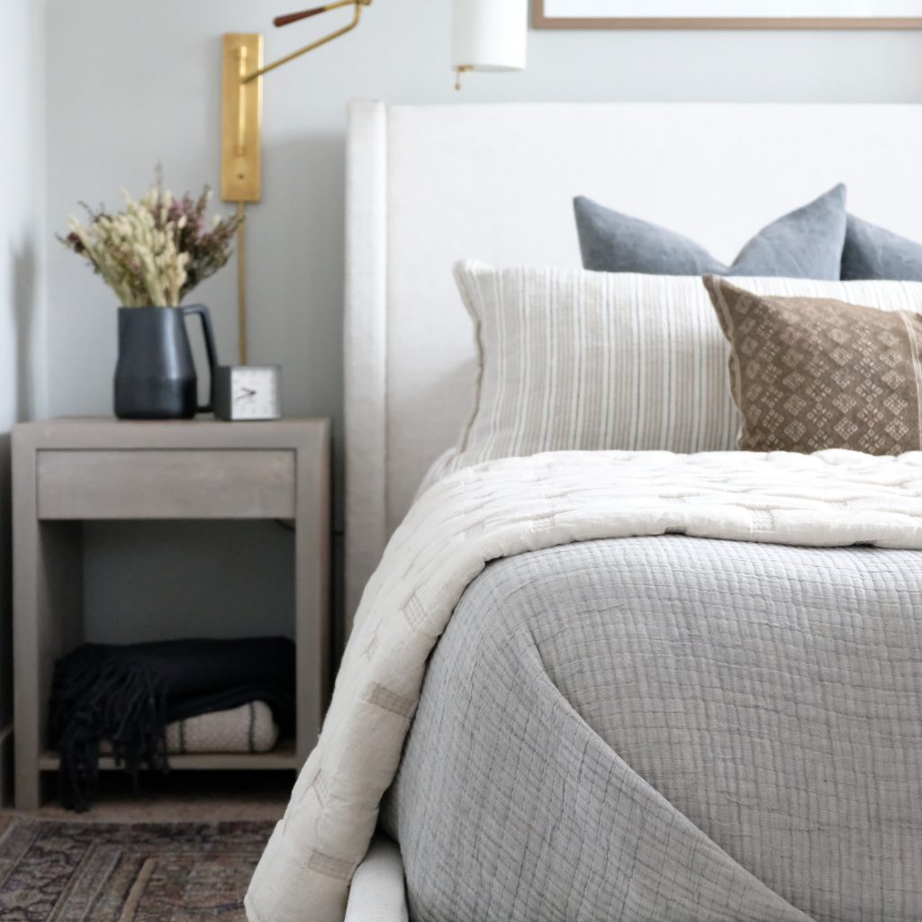
I generally look for nightstands that have some contrast to the bed. I also go as big as I possibly can in the space. That usually means choosing a nightstand that is about half the height and width of the bed. These proportions keep the furniture pieces feeling related. In this case, our room is a tad narrow so I had to search high and low for nightstands that were narrow enough but that also had some substantial height to them. I was lucky enough to snag these limited release beauties from Coyuchi before they were gone.
Furniture that is too small for a space can look cheap, even if it isn’t. When looking for affordable alternatives, make sure you’re paying attention to scale and remember that less expensive furniture is often smaller so keep an eye on those measurements.
Again, you’ll notice that their features are similar to the bed: very clean, simple lines, no hardware and in a relaxed, weathered finish. In choosing alternatives, I looked for pieces that had some visual weight to them to emulate the thick solid wood frame of the originals.
Lookalikes
I struggled for a while with finding decor to go in the lower cubby of the nightstands. However, I often find that functional items do the trick better than any decorative object can. I filled them with extra blankets (sources here and here) and lots of books (shop here) for our guests.
Rug
This rug is already amazingly affordable (sources here.) It’s difficult to get that vintage look at such a low price-point and I happen to think this pattern is sophisticated and versatile.
If my furniture is lighter in color, I generally go for a darker rug to ground the space. The contrast creates a distinction between the two. Also, pay attention to the accent colors in the rugs that you choose. I love the way a room looks subtly pulled-together when you’re decorating with pieces in those accent colors rather than trying to match your major colors.
Lookalikes
Lighting
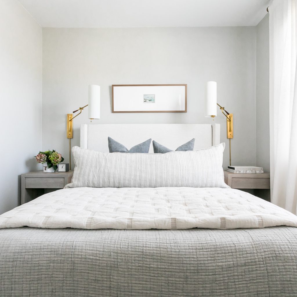
I love these sconces (source here.) I opted for wall-sconces because I wanted to keep surface space free on the nightstands. Plus, I think that their height really helps to balance out this space visually.
The lines on these sconces are fairly straight-forward and modern, but are finished in an antiqued brass and off-white shade which gives them a bit of a vintage nod. Are you starting to see a theme here?

Good lighting is pricey. There is just no way around it. In fact, I’d venture to say that lighting is one of the most important aspects to a design because it is the lens through which the space is viewed. Getting it right is so important. In sourcing affordable alternatives, I opted for pieces that were smaller in scale but still had the same visual feel.
Lookalikes
Art
This frame is 14″ x 40″ long (custom from here) which is 2/3’s the width of the Queen bed. If you’re scaling up or down for a different bed frame, I recommend sticking to this ratio for a similar look. The art piece in the frame is a vintage post card from Etsy and is a 5 x 7. I chose an oversized mat for two reasons:
First, I wanted to mix textures and patterns in this room and didn’t want the art to compete with them. An extra wide mat tones down any art piece and really allows you to get away with mixing styles. (Try it in a gallery wall like this one here!)
Second, I wanted to stick with my clean and quiet lines in this room. The extra wide mat makes a gorgeous but very subtle statement.
Now here’s a little trick: the smokey bronze frame above the bed might look a little odd next to the brass sconces if it weren’t for that brown lumbar pillow (source here.) Giving your pieces a partner (not necessarily a twin) in the space helps keep the visual balance. It looks purposeful (in a cool way) and really gives you a lot of leniency in design. If you’re not sure how to make an odd-ball piece work in a space, give it a partner!
Notice the difference below? The mixed metals become a lot less apparent with the addition of the brown lumbar.

Bedding
I love choosing bedding. If I could make a career out of it, I would. For this room, I stuck with warm hues in natural materials to create a cozy sea of creamy linens. The reversible bed blanket was a splurge but I actually found an amazing lookalike!
Lookalikes
Originally, I had a guazy blue Metalasse blanket on the bed (source here) but it just didn’t feel right. Though beautiful, it was too cool hued for the space and didn’t have a partner anywhere in the room. Once I swapped it out for the grey blanket (source here) everything fell in to place.
Can you see the subtle yet impactful difference below?
I could have an entire post dedicated to breaking down the bedding layers (and will some day!) To keep it simple for now, I’ll just answer three of my most frequently asked questions:
My bedding feels like it’s missing something, but I already have so much on it! How do I fix it?
Remove 1-2 pieces and replace them with something in a contrasting color or texture. This is almost always my solution to this question. Too much of the same thing will feel incomplete, no matter how much of it you have.
Lookalikes
My significant other hates throw pillows but our bed seems boring without them. What can I do?
A giant body pillow! (Mine can be found here.) Since it’s your only decorative pillow, make it a good one with tons of texture and pattern for interest. If you can get away with two decorative pillows, go for a small lumbar in front.
Lookalikes
My bed seems flat. How do I create a plush bed like you see in catalogs?
The beds that you see in catalogs generally have a duvet stuffed with multiple inserts. It looks inviting, but it’s not a realistic way to sleep. You can still give your bed some visual height by folding back your duvet or blanket at the top of the bed and adding a thick quilt folded at the foot of the bed.
Curtains
I think this design could have handled darker and/or patterned curtains. Even some color block curtains with a darker color at the bottom third would have been a nice way to ground the space and highlight the neutral bedding. However, to keep things simple and more affordable, I stuck with breezy ivory linen panels (source here.) Anchor them with a darker curtain rod and they will work in almost any space.
Lookalikes
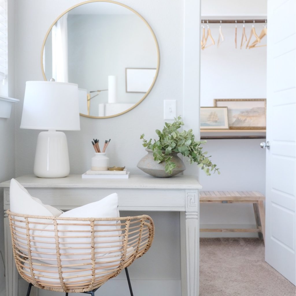
Desk Nook
Again, this space was about mixing old and new elements and just a touch of detail and contrast. I could not give up this chair (source here) which was from a previous iteration of the room, so I had to find a way to make it work.
Lookalikes
I opted for a light grey desk (source here) since I knew it would make the warmth of the chair pop. They grey color also helps tone down the table’s more traditional detailing so that it blends in nicely with the modern elements in the space.
Lookalikes
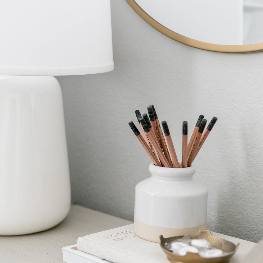
The off-white gumdrop lamp (source here) is a favorite of mine and it’s pretty affordable! The geometric vase and asymmetrical greenery add some architectural sharpness to the softer lines of the space (like the lamp, chair and mirror.) The brass mirror (similar here) is the warm “partner” that the chair needed to tie everything together.
Lookalikes
To put all of this simply: good design is often simply about layer and balance. Every element that comes in to a space should have pieces that emulate it and pieces that contrast it (in shape, color, texture etc.) and they should be placed alternately to keep everything feeling balanced.


Let’s be neighbors! Follow me on Instagram @goldcoastcanvas for more home decor conversations.
Related Posts

Fall Bedding: Layer by Layer
Though it never gets very cold here in Palm Beach, I still enjoy swapping in…
October 27, 2020
5 Times the Sanford Bed in Talc Won Our Hearts – Deanna Lee | 7th Aug 20
[…] from Gold Coast Canvas kept her smaller guest room seem bright and open while still playing up the neutral tones of the […]
C | 7th Jan 20
Thank you so much, Dani! So helpful!
admin | 11th Jan 20
Of course! Any time
C | 3rd Jan 20
Love this, Dani! Can you explain how you ordered the frame? I’d like to mimic something similar, but it only asks for image size. Do I put in the 5×7 or larger size?
admin | 6th Jan 20
Hi Colleen! Thank you so much for your kind words! Great question – I should have clarified that I ordered the mat from a separate site (matboardandmore.com). So when ordering the frame, I just entered the 14 x 40″ dimensions for the image size. I didn’t think of it at the time but I should have contacted pictureframes.com customer support – they are always so helpful, I’m sure they could help you with a custom mat order!